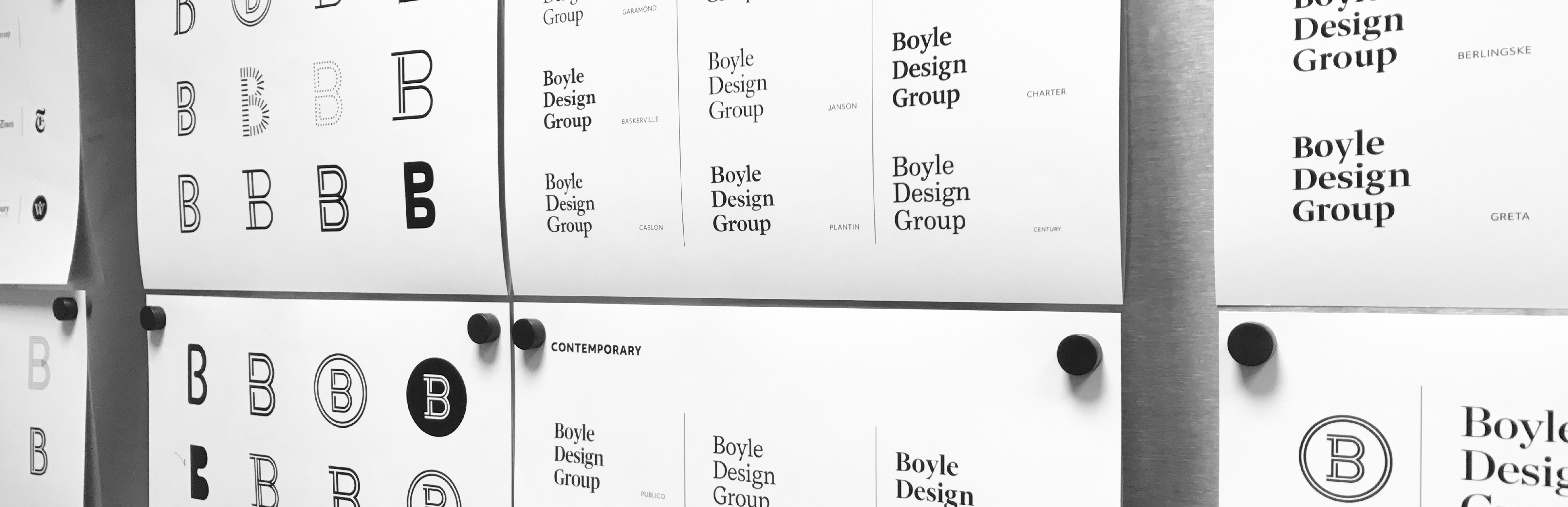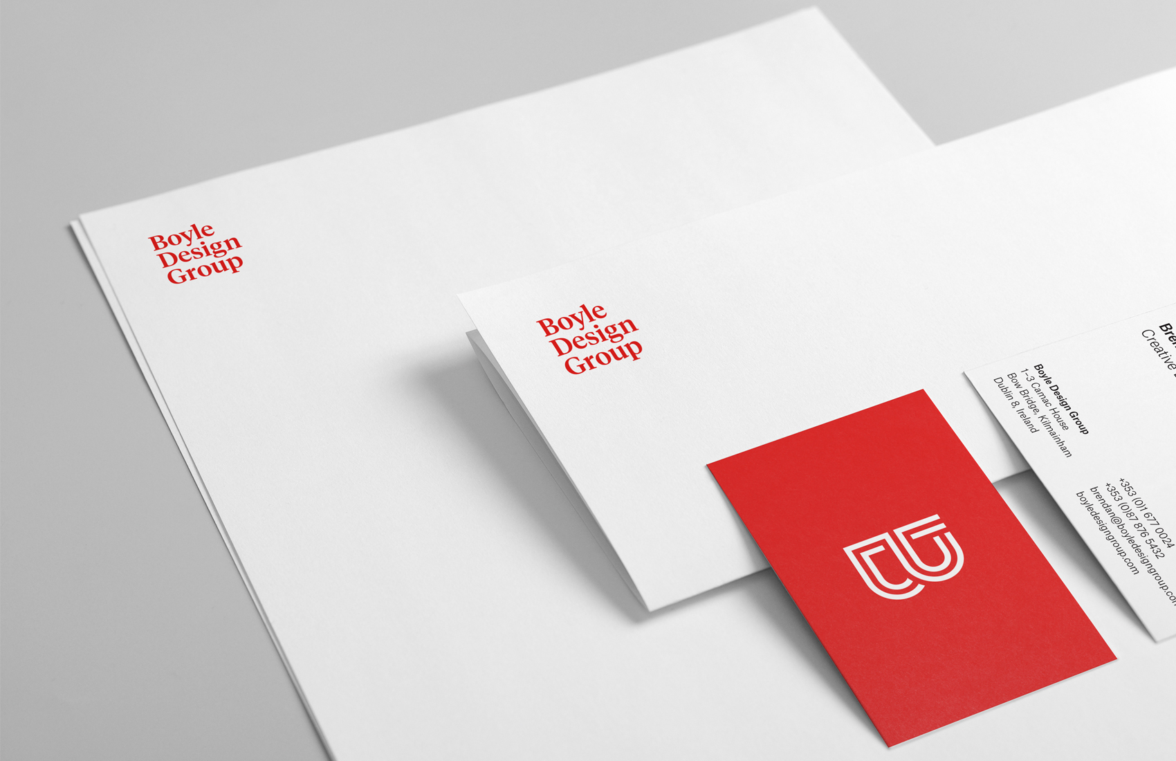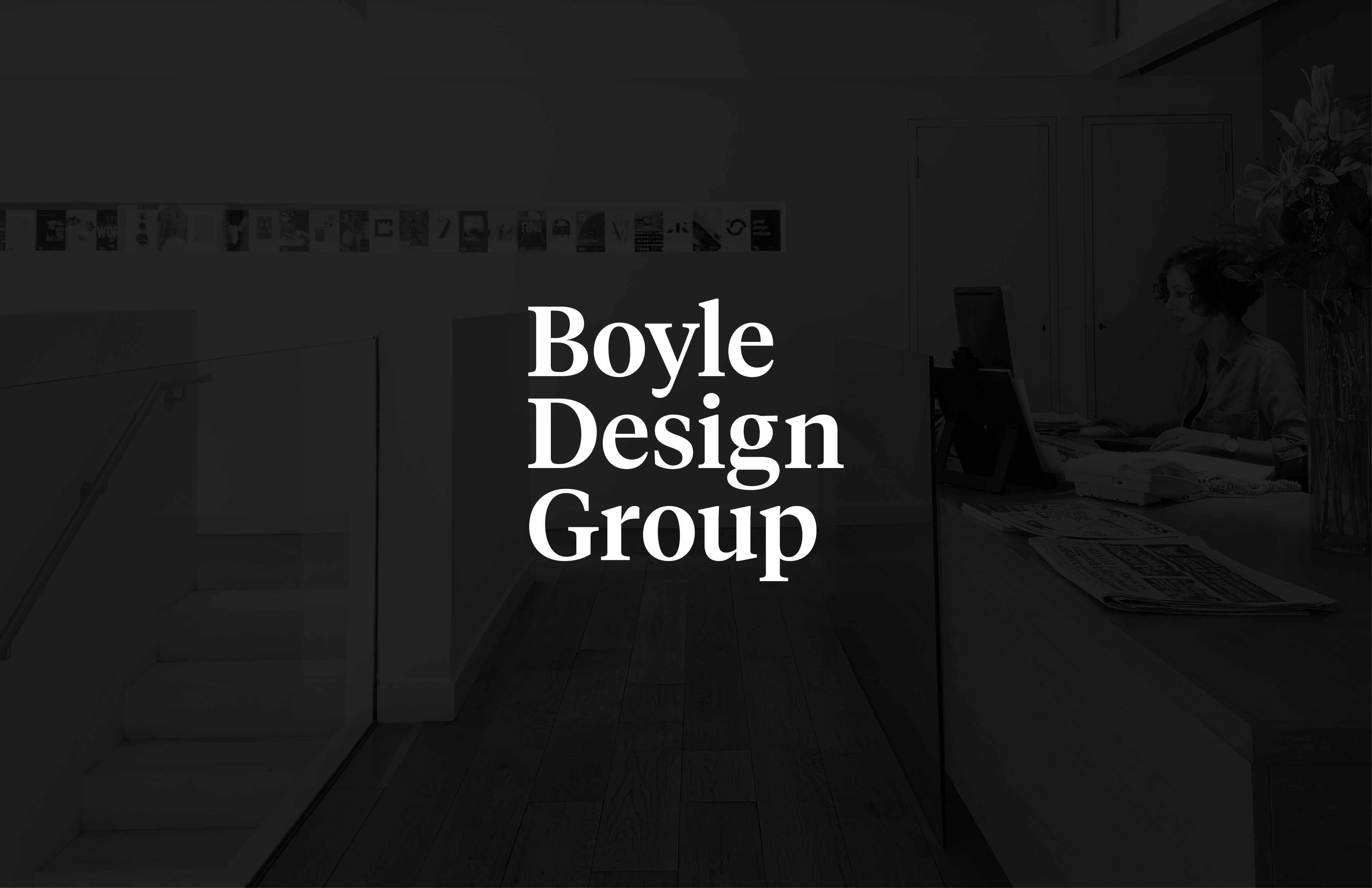
After a lengthy process of research and several rounds of elimination we opted for a contemporary, serif typeface that references our thirty-plus years of history. Spaced across three lines it strikes a smart, professional tone, reflective of the studio and its output. We contrasted this with a vivid red, which speaks to our contemporary tastes and bold sensibility. Text is set confidently in a fresh sans serif inspired by classic designs of the 1950s.
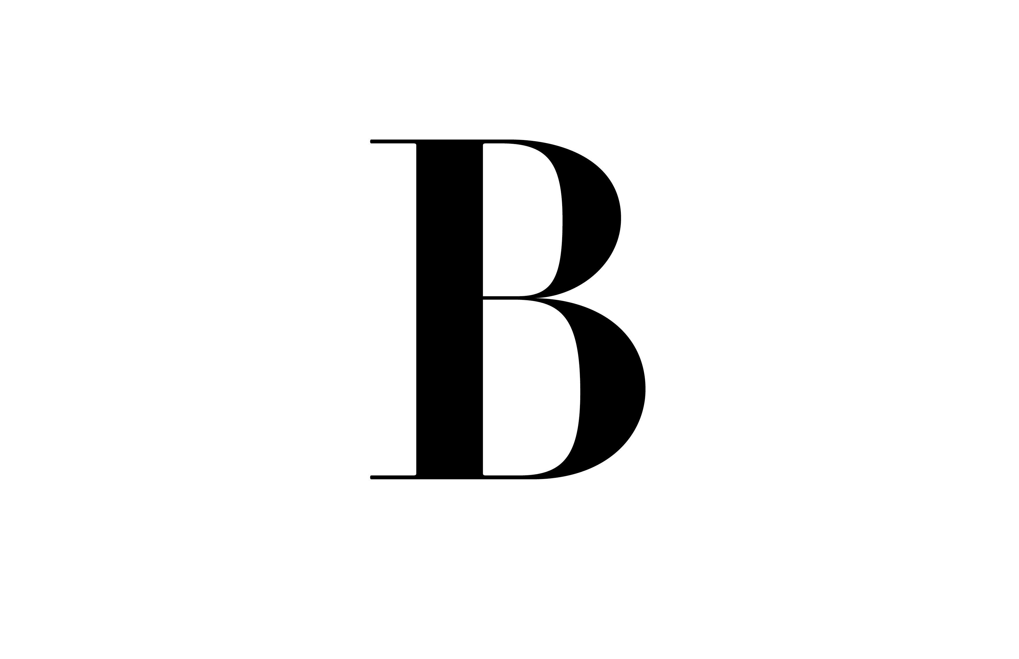
Additionally, we developed a bank of Bs that work in unison or in place of the wordmark, serving as visual shorthand for us. From the dramatic Glaser Stencil to elegant Didot, and even some custom creations, the Bs add a flexible layer to our identity that represent the unique approach we tailor to every project.